A curious connection between skittles and the 1854 cholera outbreak in London
A soft introduction to the formation of geometrical patters in nature
Color diffusion using skittles is a popular experiment, but it offers more than just a pretty picture. This picture has a structure.
It’s STEM, it’s pretty, and it’s edible!
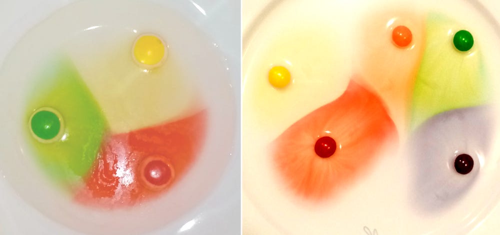
It is rarely that STEM experiments are so safe that you can eat them. Playing with color released by skittles melting in water is such a case. It is a popular entertainment in schools and homes, and it goes like this:
Put a few skittles on a plate
Fill the plate with water to the level where to the top of skittles remains above the water,
If you wait a little bit, you will see how the candies start to melt and release their coloring.

The process that drives this spread of color is called diffusion. The mechanism that drives diffusion are collisions between the fluid (or gas) molecules. These collisions produce movements of a substance (food coloring and candy sugar in this case) from an area of high concentration to an area of lower concentration.
The fluid flow induced by diffusion is also visually pleasing. You can notice various color filaments and how the flow depends on the plate shape and on the interactions with other flows.
The final distribution of colors in the plate displays a beautiful pattern as color (initially) do not mix. Instead, when two flows collide, they push onto each other and create a sharp front that separates the two impinging color domains.
Skittles can teach us math
But we are STEM enthusiasts and always have questions. In this case, we ask ourselves: is there a mathematical model that can describe the observed pattern?
For start, let’s see why two impinging flows of colors create a straight boundary surface. If you observe the distance traveled by colors from two skittles at any time, you will notice that these flows will intersect at points that are at the same distance from both skittles and positioned on a line perpendicular to the line that connects the candies. Here we assume that the diffusion speed is the same in both colors.
The important property of this separation of the plane into two color domains is that any point within a domain has the skittle of the same color as the closest one. In other words, color diffusion emanating from a skittle paints the region closest to this skittle into its color.
If we position several skittles on a plate, diffusion from each skittle will play the same game with the neighboring skittles. The result are color domains where each point within a domain has the domain’s skittle as the closest skittle to this point. Interestingly enough, what we just described is known in mathematics as Voronoi diagram (named after the mathematician Georgy Voronoy) and it has a wide range of applications in different science and engineering disciplines.
One historically interesting application of this mathematics is related to the founding moments of epidemiology. In September of 1854, a cholera outbreak in London had killed many people in a very short period. At that time people did not suspect that cholera is a water born disease. However, the physician John Snow suspected exactly that, and he identified the source – a water pump. He managed to do that because he collected a detailed statistics of deaths and their locations on the city map. Then he used the method of Voronoi diagram to identify which water pump is the closest to the people who died.
It is interesting how we can learn something very useful out of an experiment as simple as the skittles melting on a plate. Of course, you can see that skittles do not produce perfect Voronoi diagrams. It is now up to you to figure out what is happening during diffusion that leads to distorted Voronoi diagrams.


